Working with the Budget Assessment Dashboard
The Budget Assessment dashboard allows you to compare a department's proposed budget for next year with internal and external peer groups.
NOTE: This feature requires a license for Axiom Comparative Analytics.
Opening the dashboard
Users must be assigned either the Budget Admin or Budget User role plus the Comparative Analytics - Dept role to use the dashboard.
To open the dashboard:
In the Budgeting or Bud Admin task pane, in the Budget Reporting section, double-click Budget Assessment.
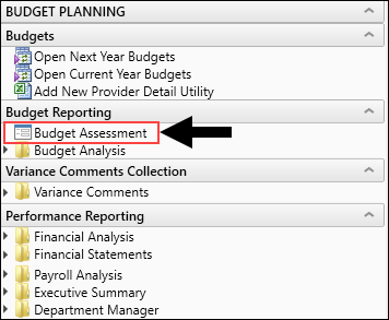
Location of dashboard in Budgeting task pane
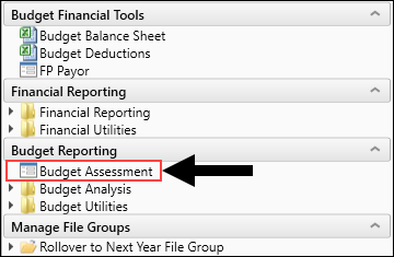
Location of dashboard in Bud Admin task pane
Using the dashboard
The dashboard is comprised of the following areas:
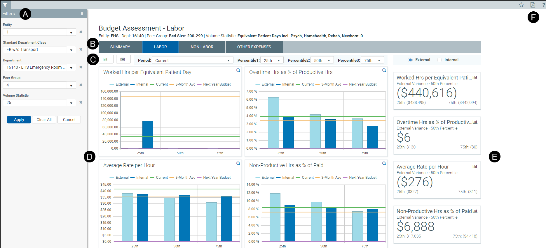
 Filters
Do any of the following:
- Configure the criteria to include in the dashboard by selecting the filter criteria options in the drop-downs, and click Apply.
- To clear a filter criteria option, click the X next to the drop-down.
- To clear all the filter criteria options, click Clear All.
The filter criteria detail you select also display above the tabs.

 Tabs
Tabs
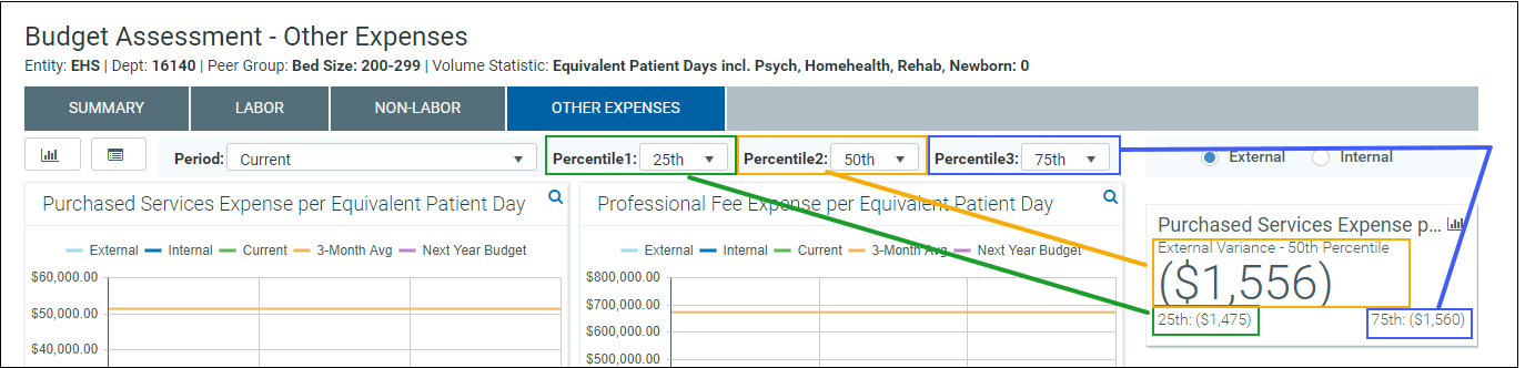
Budget comparison data is segmented into four areas: Summary, Labor, Non-Labor, and Other Expenses. Click any of the tabs to view the data comparison charts and KPIs.
 Data Controls
The section below the tabs and above the data charts includes controls that allow you to customize the report data.
Graph and data view
Toggle between viewing graphical and detailed data.

These categories listed are the same for both the graph view and the data view.
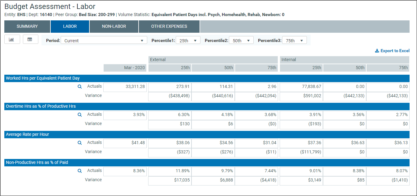
Period
Select the period in which to view data.

Percentiles
Select the percentiles to use to display the dollar variance between each of the percentiles in the KPI section of the dashboard and determine what data displays in the charts.

External and internal comparison
Select to compare data against peers outside of your organization (External) or your department (Internal). This only applies to the KPI section.

 Graphs
The graph view displays by default and compares the budget areas against performance of peers (external) and your department (internal) across percentiles. The horizontal bars show how the department selected in the filter and the peer data compare to the current, 3-month, and next year budget's percentages.
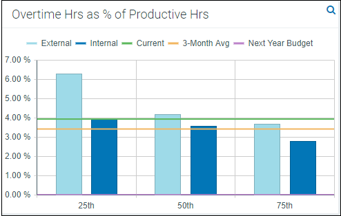
To view the detailed data behind this graph, click the magnifying glass icon in the upper right corner of the screen. This opens the Metric Explorer dashboard. For more information, see Working with the Metric Explorer dashboard.
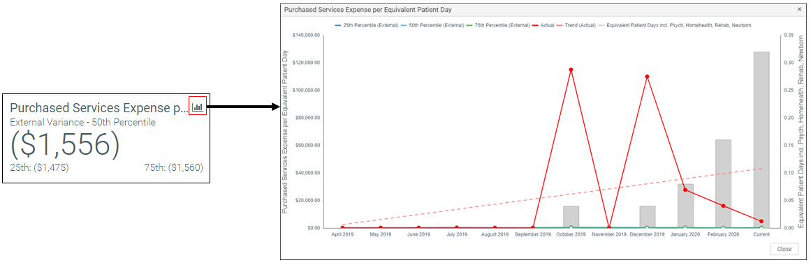
 Key Performance Indicators (KPIs)
The KPI boxes, to the right of the graphs, display the dollar variance between each of the percentiles selected at the top of the report. You can customize the percentiles and the time period used for calculations using those drop-down menus.
NOTE: The system shows the variance between the actuals (rather than budget) and each of the percentiles.
Click the graph icon in the upper-right corner of the KPI card to display a detailed graph of the percentiles and actuals over the last year.